

ABOUT
Our brand NEOPEAK is a cashflow brand in the field of e-commerce. We sell in different categories, so the logo should be quite general and not directly refer to a specific category. We give businesses an entire payments ecosystem built around what they need and nothing they don't. It’s time we stopped overcomplicating the world of payments and put business owners where they should be. In control. Whether you want to accept online or instore payments, we provide a host of integrated solutions to keep your business flowing. We’re changing payments for the better. Simplifying what has become a jargonizaed process and offering a smoother, faster experience for our customers. Maximizing payment acceptance with a suite of solutions aimed at improving the customer experience.
PROJECT OBJECTIVES
1. Analyze the core features that characterize the brand, and the transform these features into aesthetically pleasing pieces.
2. Create a common visual language that facilitates emotional memory identification, recognition and social connection.
2. Create a common visual language that facilitates emotional memory identification, recognition and social connection.
3. Develop strategies to help the business move into a new digital era and enhance its social media presence.
CREATIVE SOLUTIONS
1. Visually represent an information sources with a contemporary and technological vibe.
2. Assign strong phase & characteristics that are connected to the agency, thus fostering a relationship between the brand and its clients.
3. Highlight the agency name’s concept and use it as the foundation for developing the symbol and other brand elements.
MOODBOARD
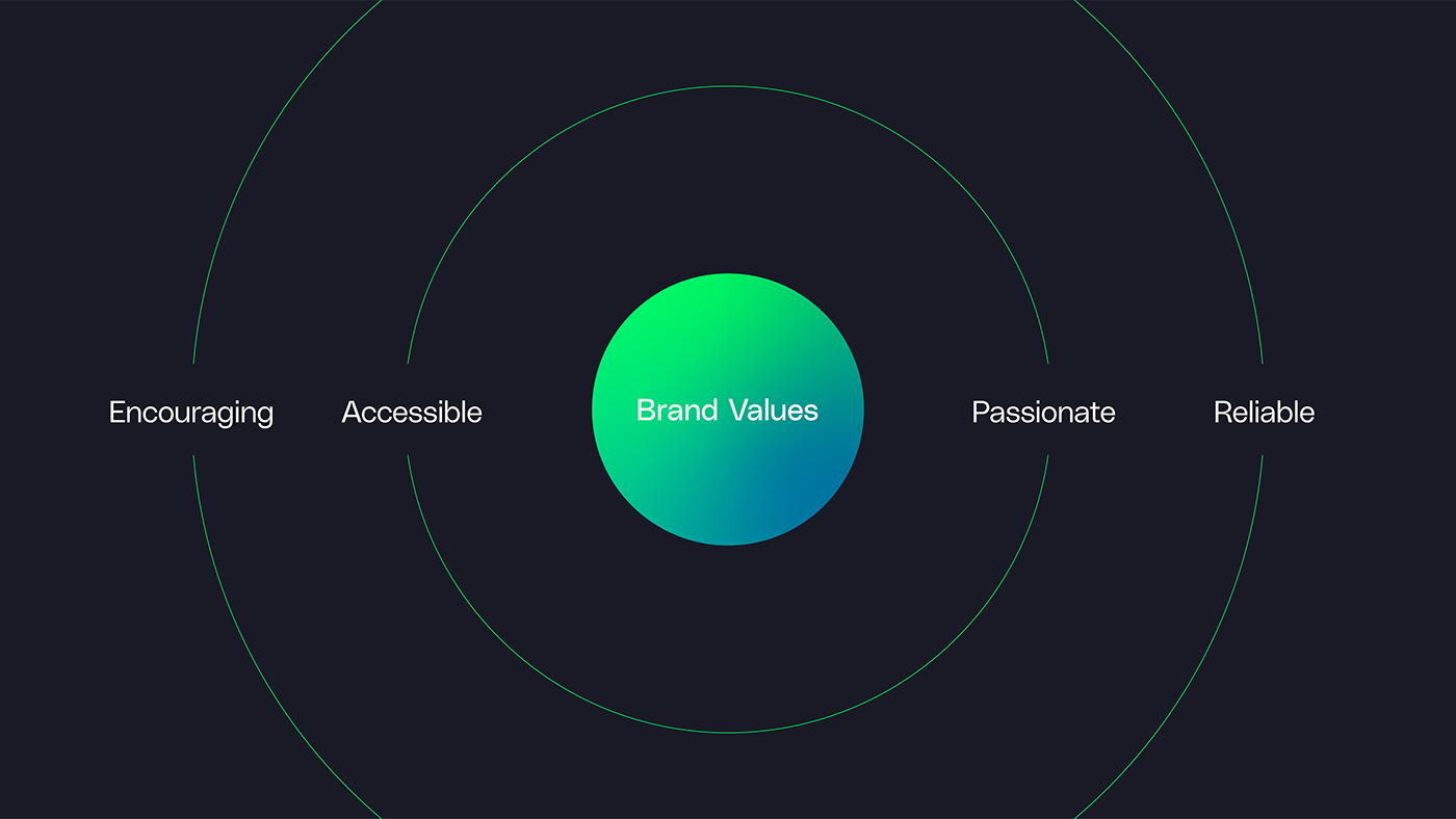
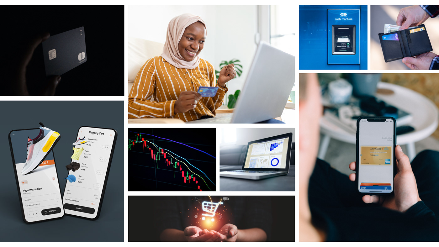
Moodboard is essential to humanizing the brand and promote the idea that our services are available for which group of people and for which purpose. It gives us the chance to illustrate our objectives and show how our service may benefit anyone and everyone willing to modernize their companies and utilize our seamless financial solutions. It is also called photography as we attach many ideas of pictures from where we gathered information and ideas from.
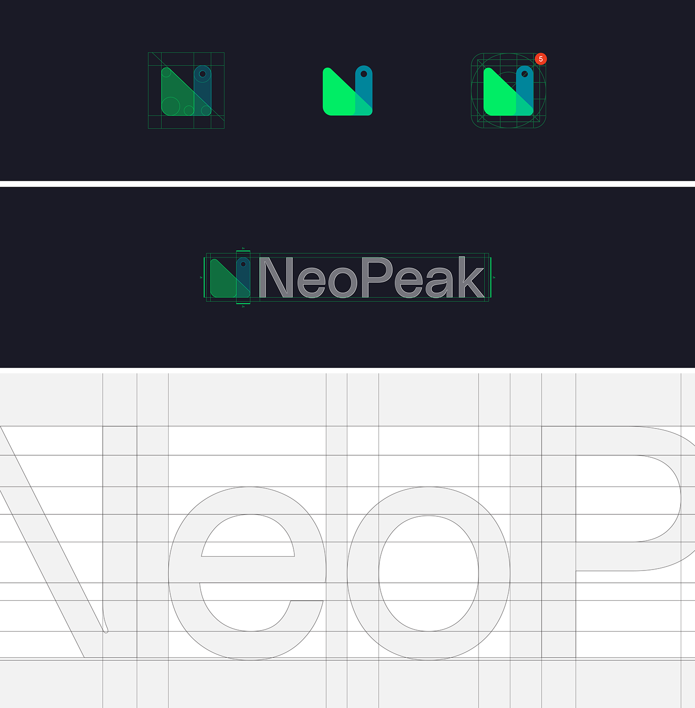
GRID
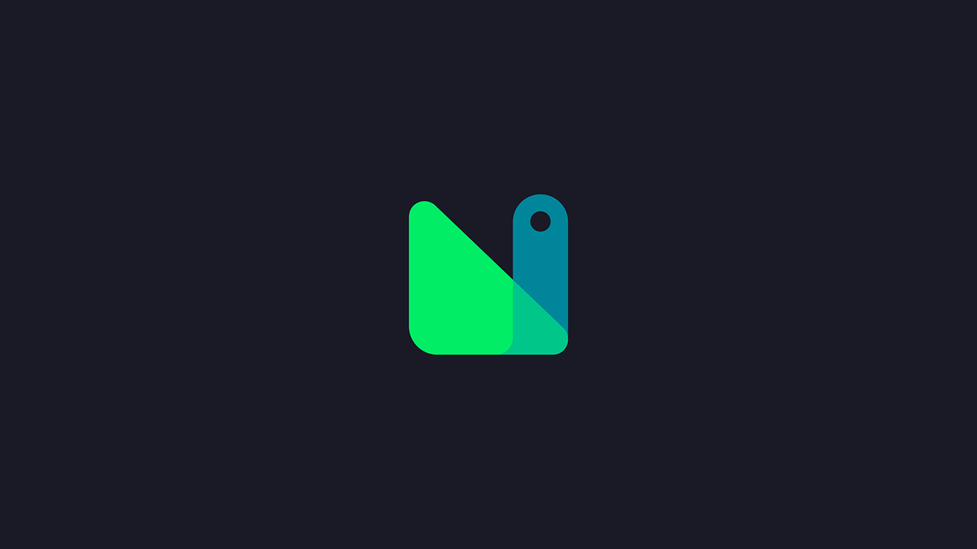
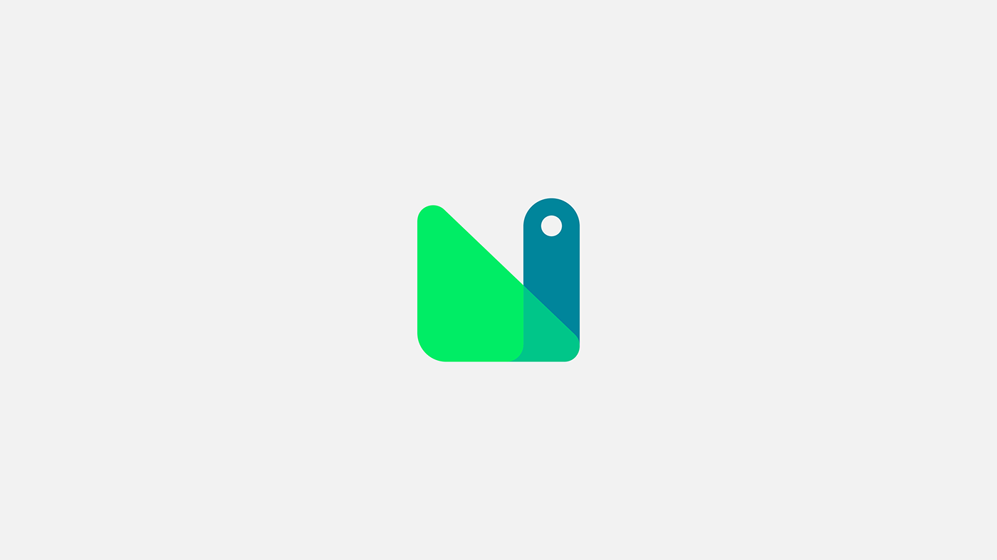
The grid was constructed utilizing several rectangles and circles, starting with the idea of a specific symbol, with the goal of creating the letter "N," the brand's initial letter, as well as a satisfying and aesthetically attractive outcome. As can be seen on the side, the logomark is perfectly geometrical and distinctly visually represents the brand.
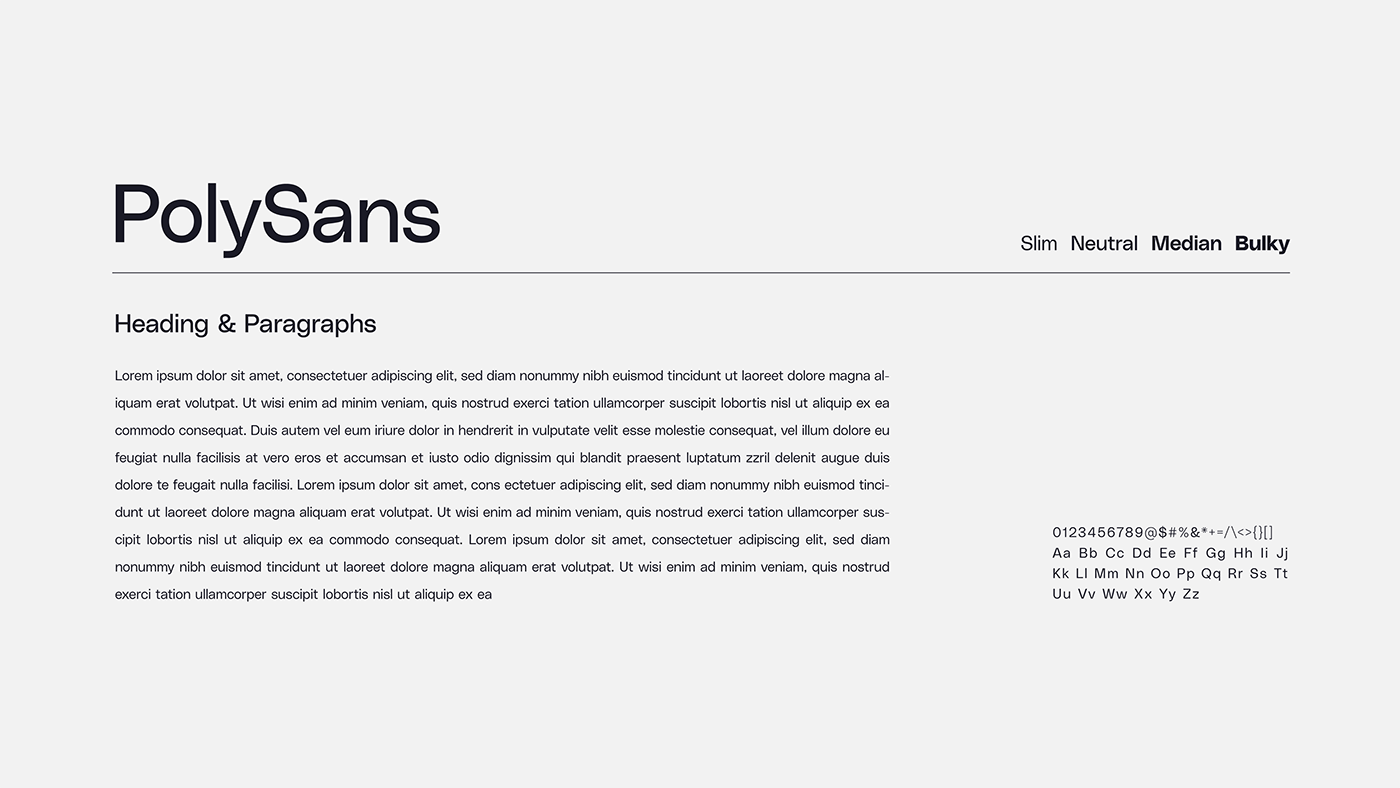
TYPOGRAPHY
The font used to create the logo is a Sans Serif style called "PolySans." The typeface was modified while attempting to keep forms that convey the notion of a more contemporary, expert, and adaptable brand. Reading was made more enjoyable by applying the optical adjustment between the letters, which visually formed a fit between them.
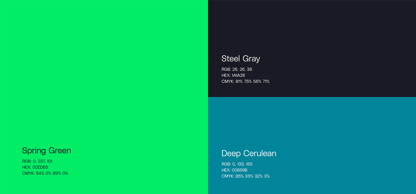
COLOUR PALETTE
The basic color palette chosen to create the brand is supplemented by hues of green, based on market research and focusing on the brand's existing positioning. These colors were used to create a secondary palette that can be used to help assemble the visual identity, especially in digital media.
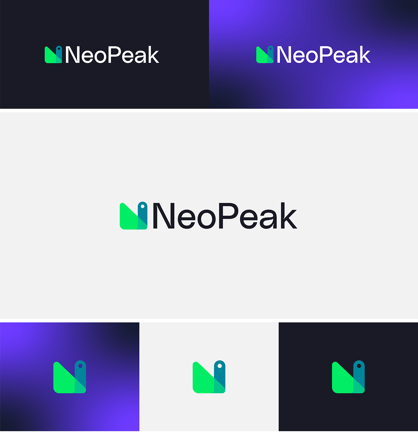
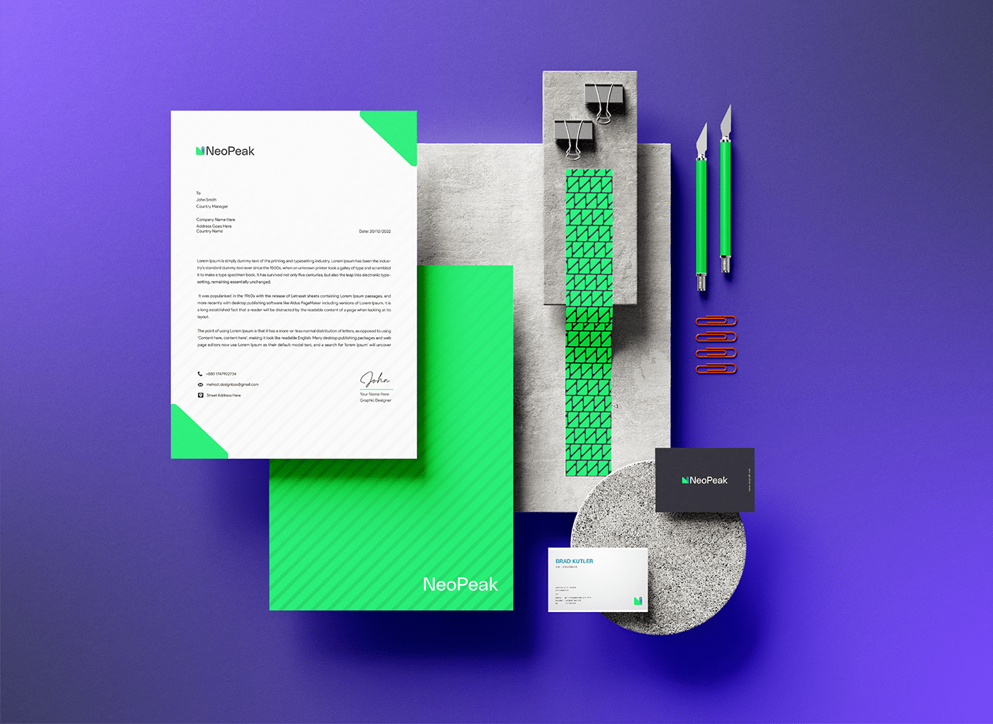
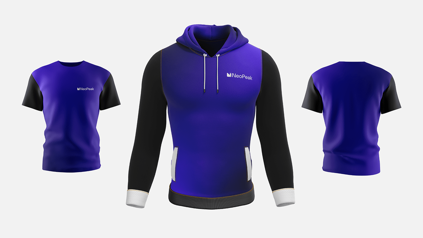
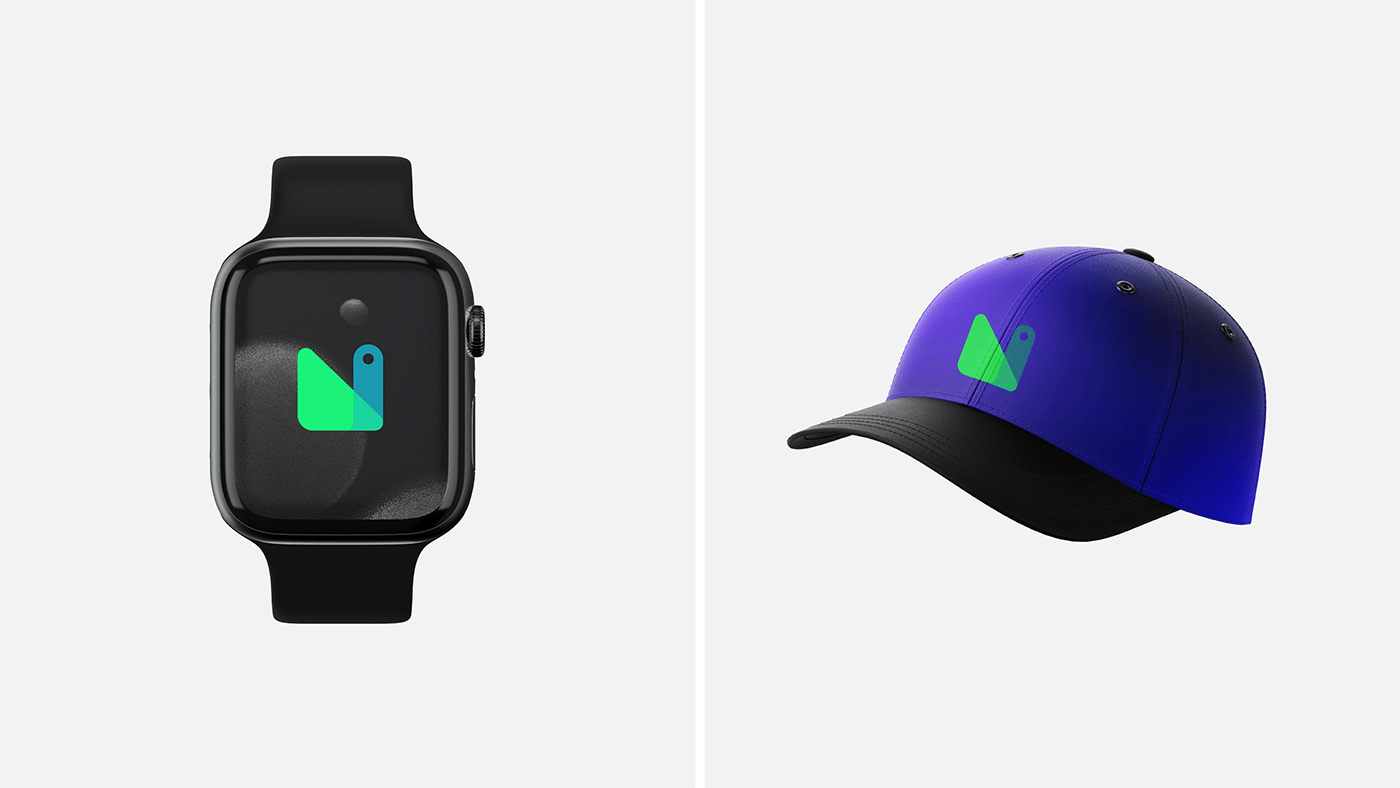
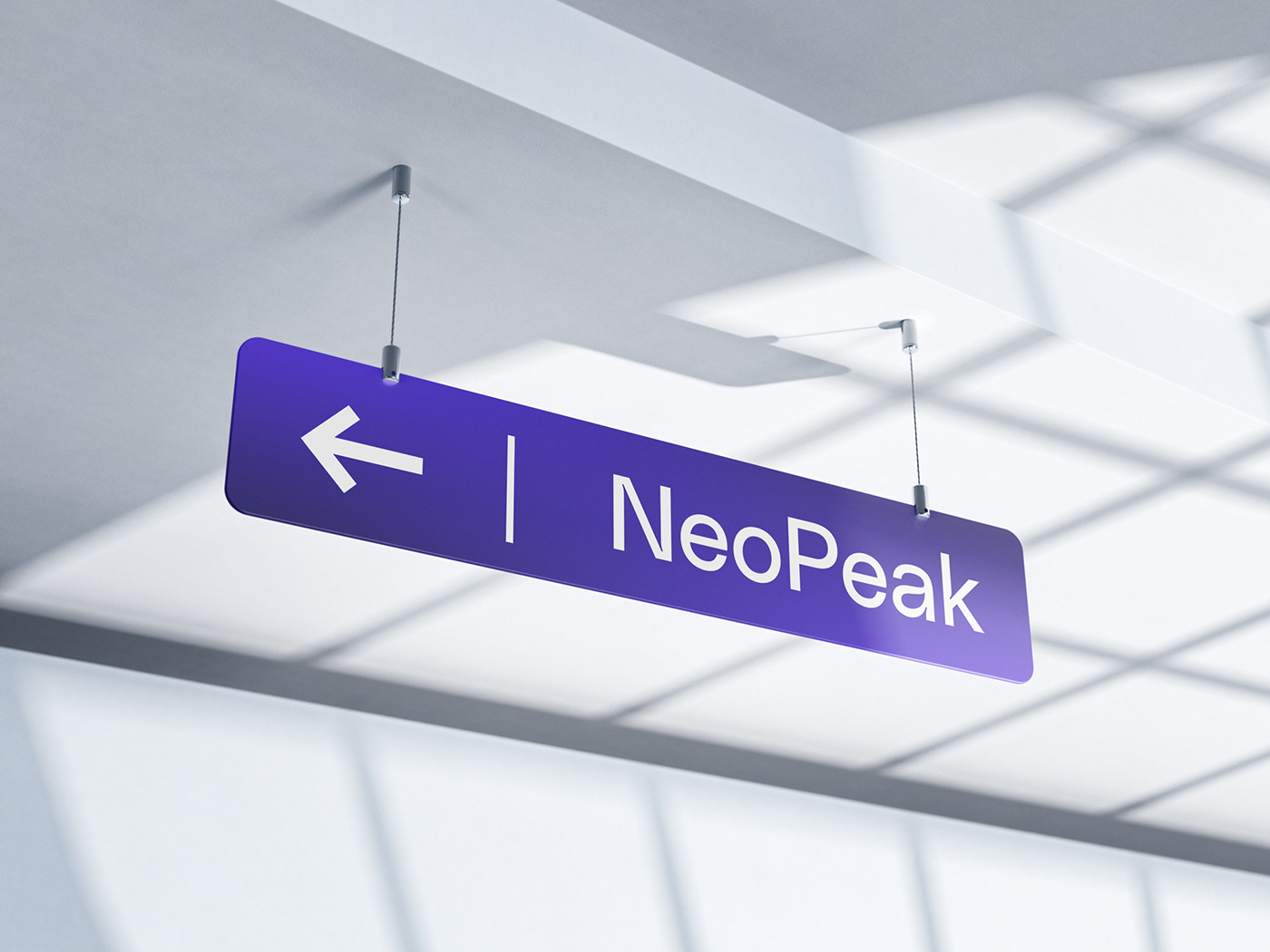
BRAND APPLICATION
This is the rollout of our new brand identity across all of our brand assets, including our letterhead, business cards, and other corporate materials, as well as our banners, posters, and other client touchpoints. Interacting with our clients through a consistent brand voice and aesthetic is a significant step toward letting our clients get to know us as an organization.

We are open to new projects!
Find us on Professional Platform
Quick Contact
Become a part of our communities
Copyright © 2021 Opedia. All rights reserved
All graphic elements used is just for design concept.
All graphic elements used is just for design concept.


